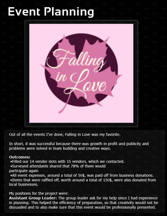
Quick look at what I have done.
Reply
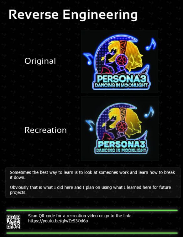
This portfolio is hard to upload for emails but you can enjoy it here as a slideshow.
This was a project I worked on a while back but I still wanted to share this project.
I wanted to work on my Adobe Photoshop skills and I started to work on something that no one has done before. I then realized I have never turned an animal into a fruit.
After many sketches and trying to come up with something that no one has done before, I decided to make a hybrid between a armadillo and a watermelon.
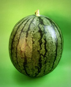
I then purchased this photo to alter it’s looks.
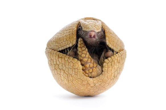
Purchased with rights to alter
Then I searched the internet and found a decent photo of a watermelon photo, with copyright free rights.
Then working on it, getting good critiques from my social medias, I came up with this outcome.
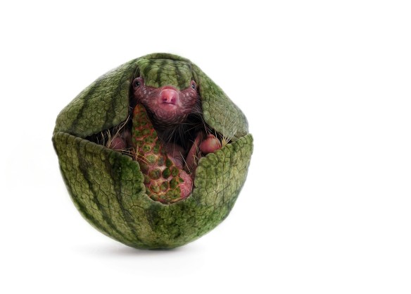
Final Product
It was fun and it had been a while since I had worked in a creative program such as Photoshop.

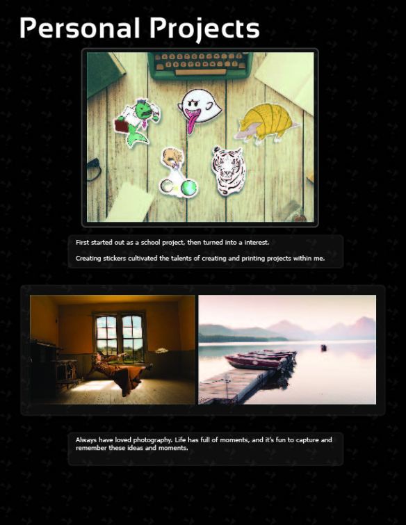
This gallery contains 5 photos.
I have so many memories and photos in my library but I condenessed it down to five photos that I continually look back on. If you would like to see more of a particular subject, let me know by commenting … Continue reading
Found this add on Twitter. Kind of shocked me that a majority of the “adds” on my channel are actually not paid. I found this out because none of them did not have the promoted icon at the bottom.
Even so, I found this one and it was visually pleasing to me.
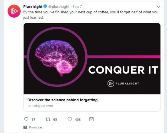
Color
I found this to be weird but the colors in the add and the logo are different. The only similarities are that they both are gradients (which are typically taboo in the designing world.)
But the theme is somewhat consistent to my eyes.
However, the only thing that bothers me is that all the gradients go side to side. While the gradient on the brain goes up and down. Maybe they saw how it looked that way and decided that it didn’t look so great.
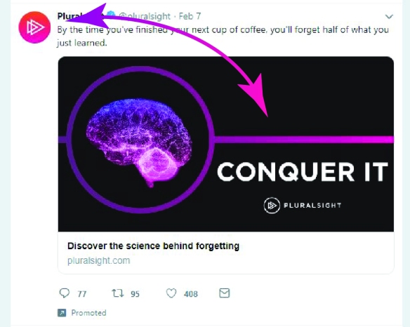
Typography
Even though the colors were nice, phrase and symbolism is what actually stopped me from scrolling any further. The image is big, so it makes sense that they also made the words big as well so that there would be a coordination between the two.
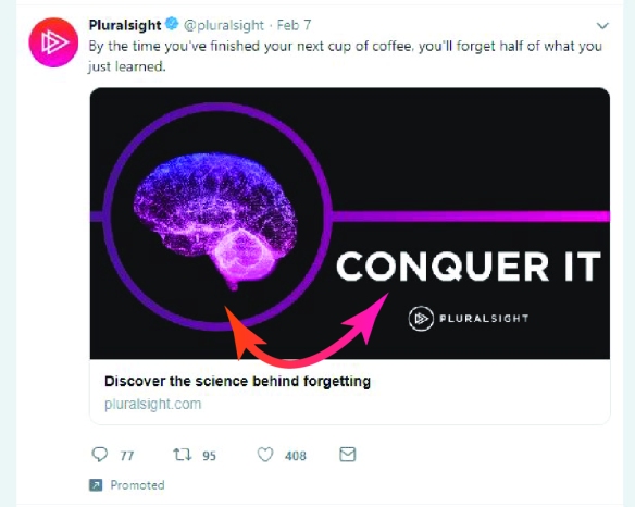
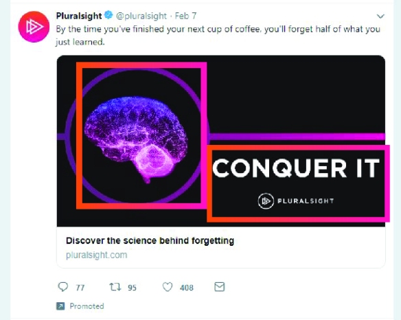
Composition
The composition on this is not quite the golden rule. Though it does almost follow a spiral pattern to the visual flow. I will say that this is more composition. As shown above the advertisers put these in almost spaces or squares of themselves. Yet, how they are placed make them still flow together.
Facebook came out with a video after being accused of sharing fake news it seems. I haven’t watched the whole video but here’s some elements I’ve seen.
Contrast
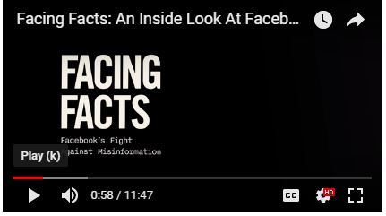
Simple transition from a poster saying “facing facts” to a black and white screen. The poster had some aspects of color and contrast but the transition fade added more to this effect.
Depth and breathing room.
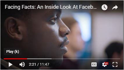
This scene follows a man up from the computer to his face. I’m guessing this camera man had the camera zoomed out and then cut in during the edit process. It would be difficult to make sure that the face was perfectly aligned to the back and have breathing room for the front of his face.
Lines
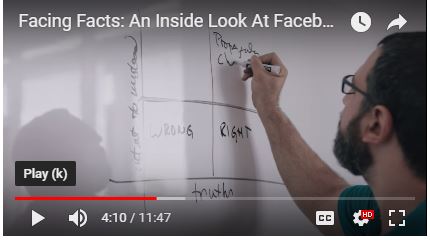
Sure you can say that the chart is a whole bunch of lines but he also is using his arm to draw attention to what he is drawing. Also he would stop pointing and drawing to draw attention to himself instead of the chart.
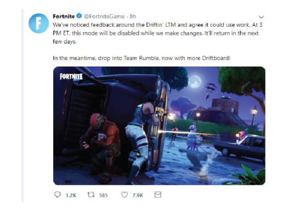
Recently Fortnite had some troubles with a new limited timed match (LTM). Currently, they are fixing the problems and have sent out this report to the community explaining the situation. This particular post was made one twitter.
Now I’m critiquing the visual aspects of the post.
Rule of thirds is something I always look for in a post. Everything thing is not perfectly aligned but it doesn’t have to be. The points of interest are not in exact center, which is nice and I have only seen a few pictures that have successfully put the subject in the middle.
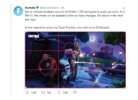
For it being a midnight fight scene, the brights and darks work in the artist’s favor. I’ll talk more about this later but this also helps with the lines that draw your attention around the picture. Personally, the man flying down from the glider pops out more than the bright bullets being fired down below.
As mentioned before, this post uses aspects of contrast to create the paths that move our eyes around the picture. The obvious line is the bullet creating a line from one car to another. Then the closest women is facing towards the direction of the glider, and the man on the glider is facing the direction of the teddy bear which completes the cycle.
Obviously this is about the newly released game, Apex Legends. Even though I think the game is amazing, I will be focused on the post itself. On February 3rd Respawn entertainment [creators of the game, Apex Legends] tweeted about a “teaser stream” that will be giving a glimpse into their new game.
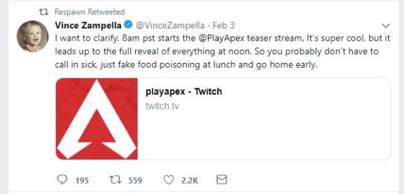
However during this stream, they did not only tease the game, but released it mid stream! Imagine if you saw the first teaser to Avengers: End Game and the movie was released mid teaser.
The influx of players was staggering with 1 million players joining in the first 8 hours.
proximity: The Apex logo is a little too close to the edges. If they would have shrunk it just a little bit, there wouldn’t be a lot of that “trapped” red color at the bottom.
typography: Cleverly phrased wording towards the typical gaming community of males between 18-32, and who are working. Saying that they don’t have to miss all of work for this important stream.
Layout: Everything seems well placed except for the person’s logo. I actually had to go back to make sure that this was an actual representative of Respawn Entertainment. If he would have changed it to a gamer looking logo, then I would have been quicker to believing it. Right now I want to believe it’s some random old person with a vintage picture of them as a kid.
Incredible outcome, and even more amazing that there was more leaks in the past, forecasting this game.
I am still wondering if I should do two different things. If you have any ideas, please comment or make a suggestion.![]()
Project 1
What
One is probably doing a vlog like set-up where I show my progress in drawing. Every week I will post about my progress every week. Showing stage one for rough sketches, stage two of refining, then finally showing the final product.
I would even consider making a sheet of stickers every so often and call this the “sticker door project.
How
I think posting 3 times a week would help people see the steps of creating, and it will also help them see the improvement of everything.
Where
I will be mostly focused on instagram posting pictures and videos.
Project 2
What
I thought I could do a project I did in the past where I teach people Japanese through gaming.
How
Posting frequently would be great but it is time consuming. Streaming is the best option, but my internet does not support it that well. If I stream it would have to be early in the morning. Instagram was the next best option and will probably be the primary focus.
Brian Moncus is an artist that I have been following for a while. I first started watching his content because a lot of his art is based on the video game called Destiny. I haven’t played Destiny in a long time, but Moncus’s content still intrigues me because of how he creates his art style.
Link to his channel: https://www.instagram.com/brianmoncus/
Recently for one of Moncus’s streams he drew Hellboy, probably because of the trailer that came out in December.


These two posts are almost exactly identical (one being more polished) and were posted at different times. However the likes are where the difference really shines, one got about 4 thousand, while the other got 2 thousand. Almost two thousand more.
Timewise these posts were close. The one to the right was posted first and the one to the left was posted three days after.
The reason why I think one got more while the other got less was the target audiences. The one that got two thousand likes was focused on his streaming audience. Posted about his times and results about his streams. The other simply says “Hellboy” with a devil emoji. Even though it’s simple, it got twice as many likes. Now he most likely still got his mainstream audience that follows him consistently, but he also got the hellboy fans.
This won’t be a consistent crowd for him, but he may have got a little more fans because of this art piece that reached out to a different fan base. I don’t know if this was Brian’s plan to post twice and get a temporary boost in likes but it just may prove effective.
Analysis
I will be focusing my analysis on his later post that got 4 thousand likes.
Purpose
To showcase Brian’s latest art work.
Audience
For this post his audience main focus was Hellboy fans. This would be strong connection because of the recent trailer for the upcoming Hellboy movie. Would have been stronger if he made the art piece closer to the trailer’s date or the movie premier, but it is still relevant.
Outcome
To measure how successful this post was, we can see how many likes and comments were made on the post. Obviously Brian would be able to see a clearer picture on how successful this was due to his dashboard sharing data to him about how many shares, interactions and other actions that were made.
From my perspective and comparing it to his other posts (which look like they average around 2-3 thousand likes), this post was a success.
